New work for Riggo Design. Riggs Barr creates custom metal furniture and accent pieces out of his studio in Chicago. He makes cool stuff and he’s a seriously nice guy. Check out his site and buy something!
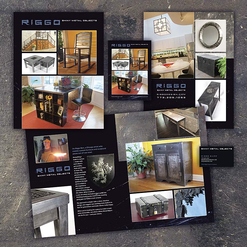
New work for Riggo Design. Riggs Barr creates custom metal furniture and accent pieces out of his studio in Chicago. He makes cool stuff and he’s a seriously nice guy. Check out his site and buy something!
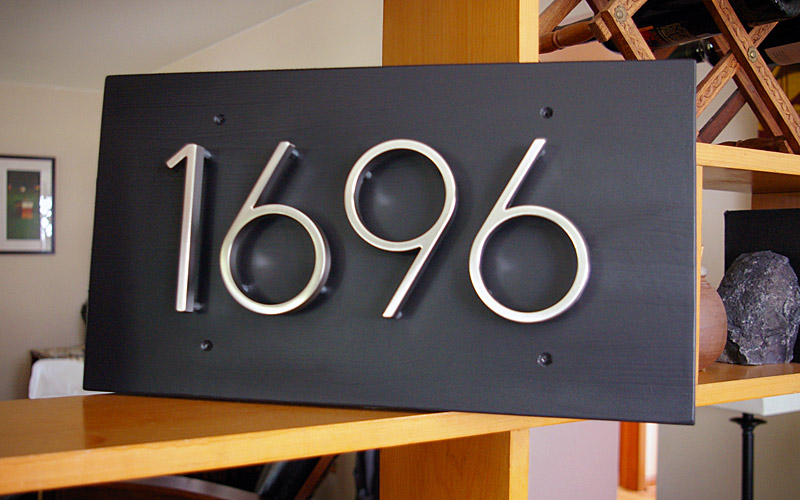
The finished house numbers sign. Aspen board, sanded, with two coats of white primer, two coats of dark grey primer, and a final clear coat.
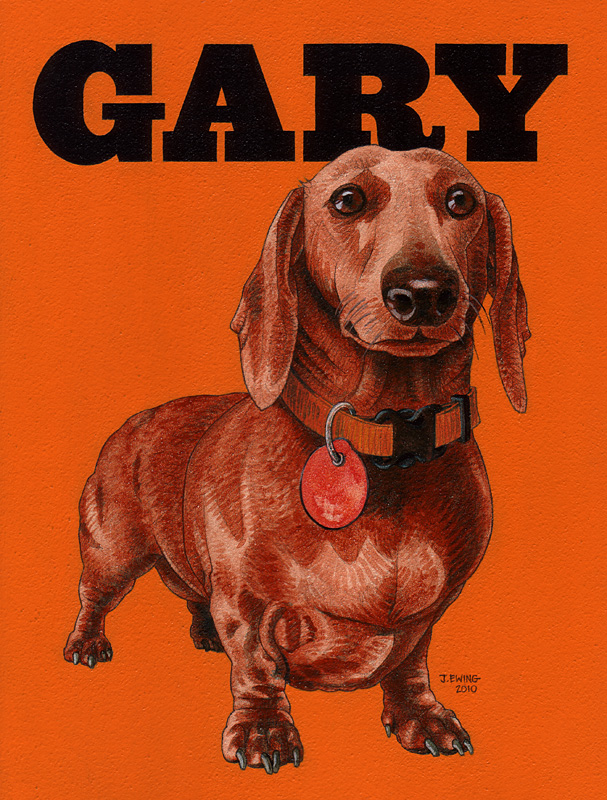
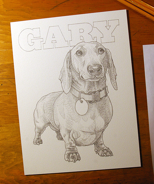
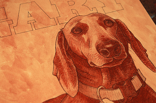
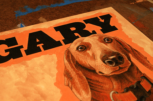
Another acrylic experiment, this little painting was inspired by the recent loss of Aaron Draplin’s Dachsund, Gary.
I hope the likeness is somewhat close. I used photos from Mr. Draplin’s site for reference.
And some detail shots from the work in progress:
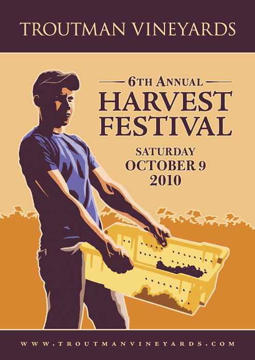
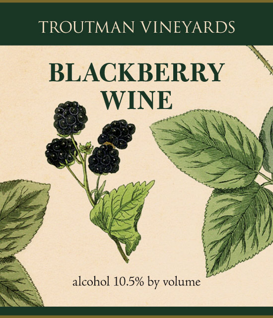
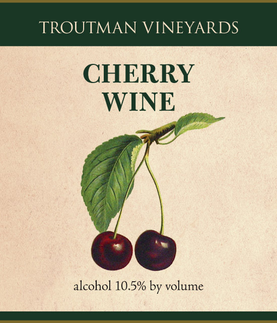
New work for Troutman Vineyards. Each color was a separate “plate” drawn in black ink on a sheet of film, scanned and vectorized in Illustrator, and assembled in Illustrator and Photoshop.
Happy Birthday to my best chinchilla friend, Sasparilla! He’s 10 years old today.
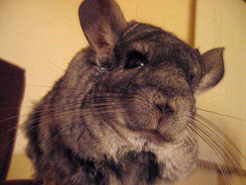
If you haven’t already seen it, check out The Chilla Fix.
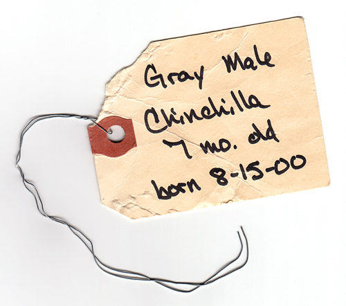
Many happy returns, little buddy.
Just launched, new work for SARA (Sharing America’s Resources Abroad), a nonprofit organization affiliated with the Ohio Conference of the United Church of Christ that distributes medical supplies, equipment, and expertise throughout the world.
The SARA group was looking for a site redesign that would be a better showcase (in words, photographs, and video) for their outreach efforts, as well as a driver for donations and a way to generate interest and cooperation from similar organizations. Existing Flickr galleries were incorporated into a photo page, and Wordpress installations drive the News and Events sections of the site. Other pages are edited using the lightweight Perch content management system.
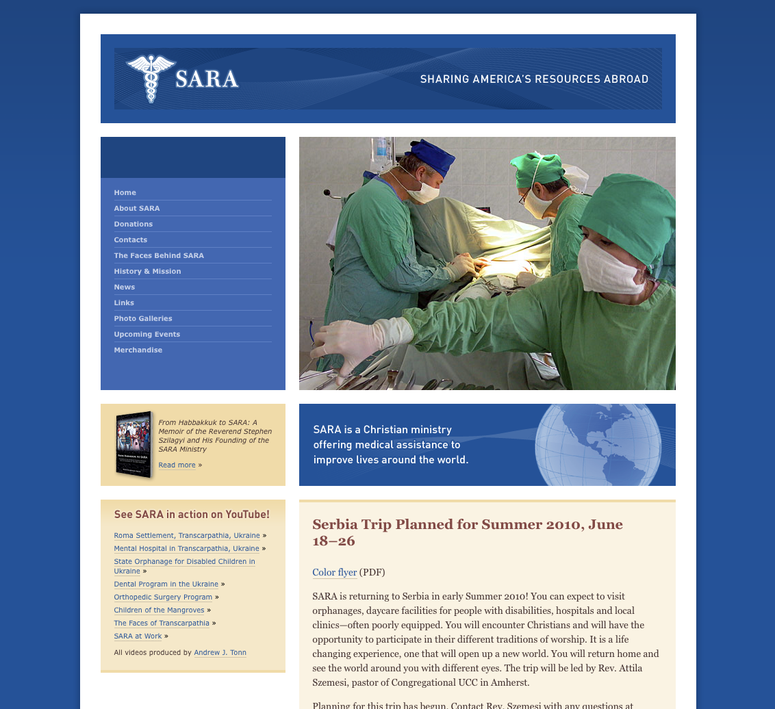
The blues, golds, and light browns of the color palette represent the global medical background of the organization without appearing too clinical, and are a nod in the direction of the U.N. Type consists of New Caledonia for the logotype and printed text materials, with DIN complementing.
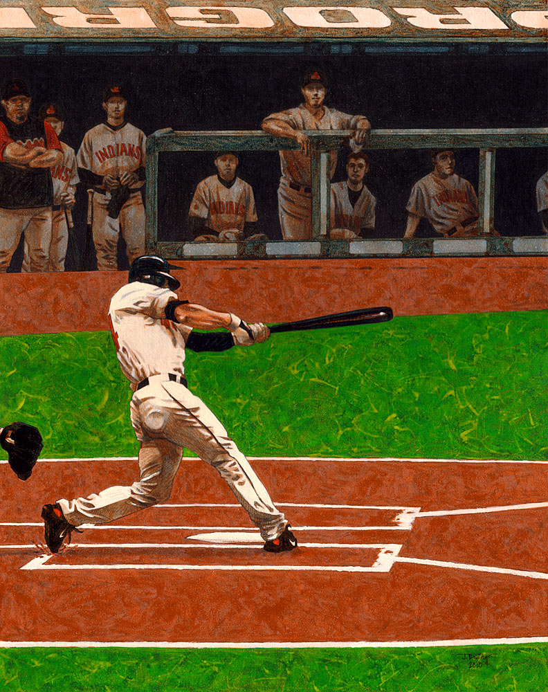
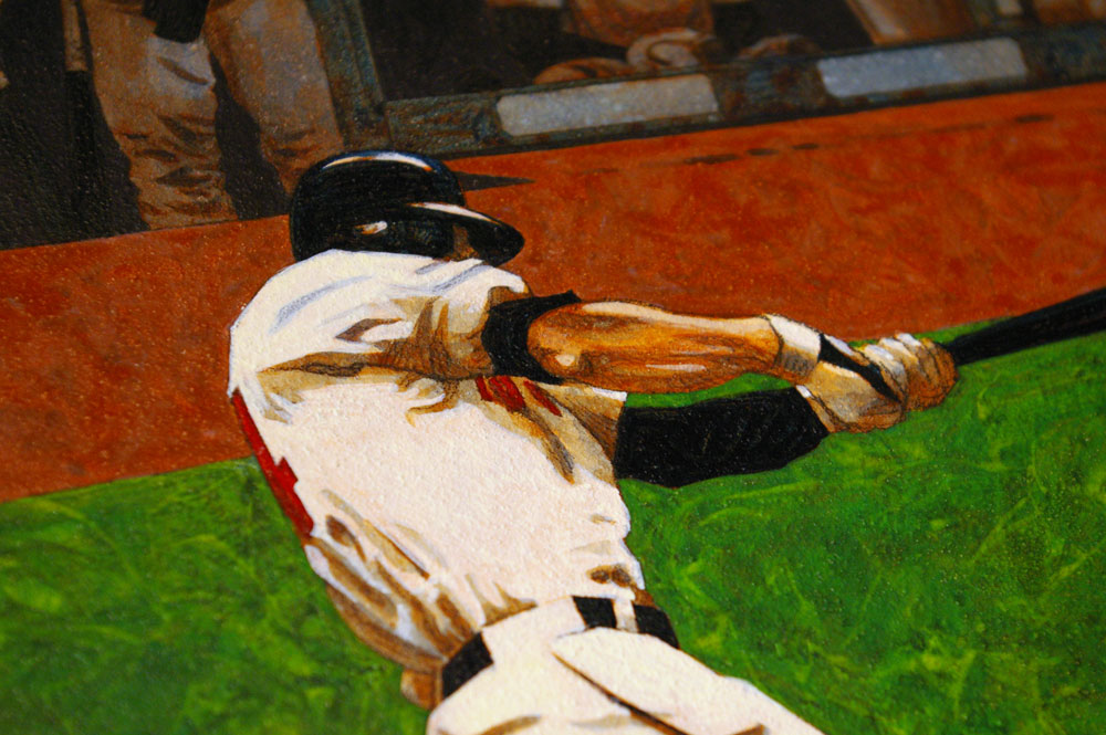
Grady Sizemore at Progressive Field, a gift for a friend. Acrylic on Aquabord, 11 × 14 inches.
Detail:
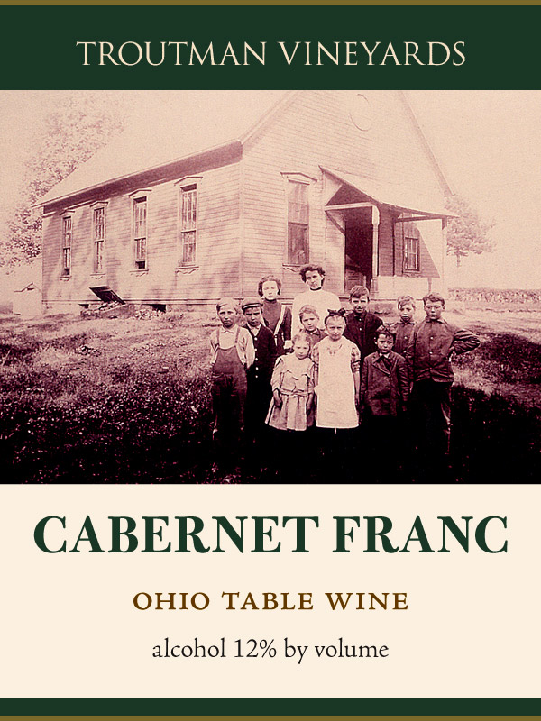
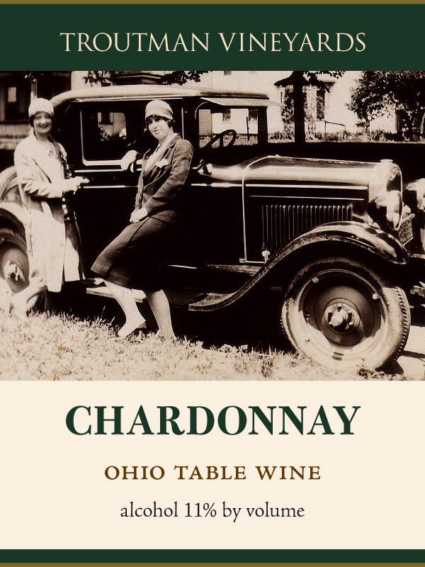
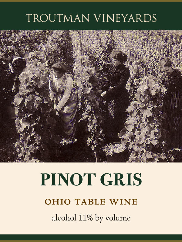
Following a website redesign, Troutman Vineyards’s entire range of wines will be getting new labels to match. The revised identity leverages the Troutman family’s rich agricultural and viticultural history, and makes prominent use of family photographs. The colors take their cues from the imagery as well as a refinement of the original identity’s palette. The elegant workhorse typeface Bulmer has been paired up with Adobe Jenson.
First up, the popular Farmer’s wines:
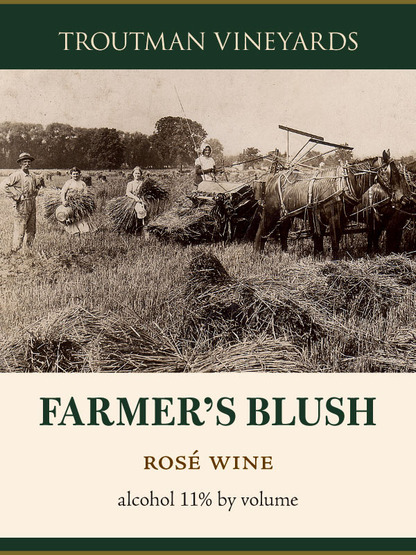
Long before the grocery store bread aisle the wheat was harvested using horses and the skilled hands of our friends and neighbors. When the weather was good there would be enough flour to put bread on the table for the year. Now when the summer is warm and dry we make wine for the table. ¶ Farmer’s Blush is a sweet rosé made from a blend of lightly pressed red grapes. Best enjoyed chilled with a fresh loaf of bread.
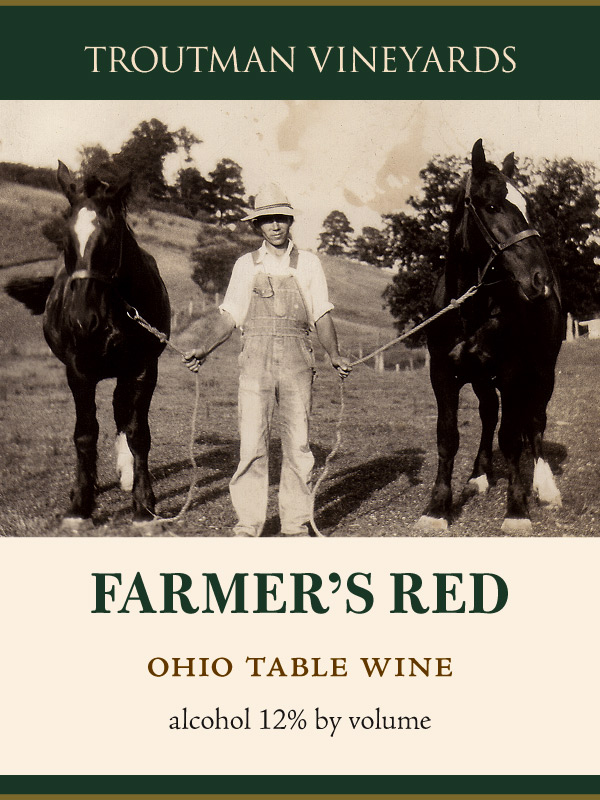
Grandpa Ralph kept his horses long after he bought his first tractor, and we still grow Concord grapes long after more fashionable grape varieties have come along. Maybe it’s a way to honor the past, or maybe it’s just stubborn farmers being stubborn. ¶ Farmer’s Red is a sweet red wine best enjoyed chilled with peanut butter sandwiches.
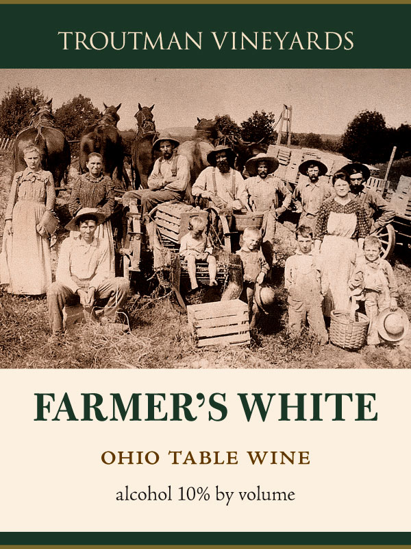
In the fall of 1907 the Troutmans gathered with their neighbors to harvest potatoes, pausing long enough to take a photograph. Over one hundred years later the horses are gone, and now we gather each fall to harvest acres of grapes. ¶ Farmer’s White is made entirely from Ohio-grown Vidal Blanc grapes. Aromatic and fruity, this semi-sweet white wine is a perfect match with soft cheeses or an apple pie.
Next, a selection of varietals:
And for the fruit wines, vintage botanical illustrations were repurposed to fit the historical theme.

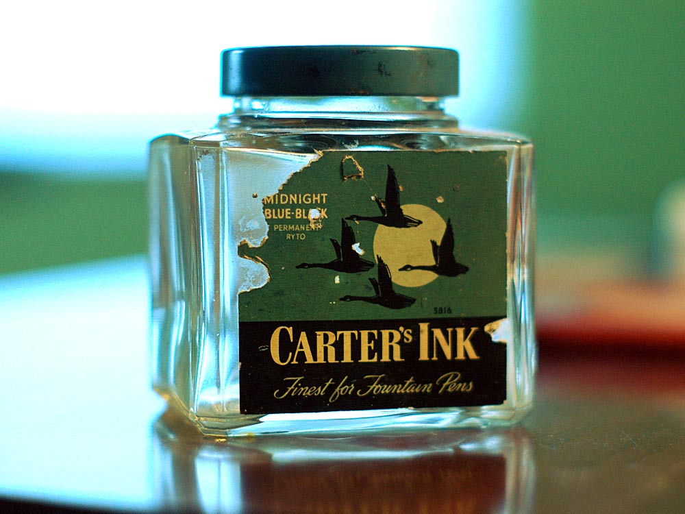
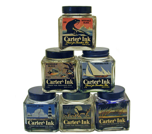
Two more ink bottles for my collection, found in an antique store over the weekend. The first is Carter’s Midnight Blue-Black. I’d like to find more of these in different colors and in better shape like the ones in the photo below (from Pendemonium.com).
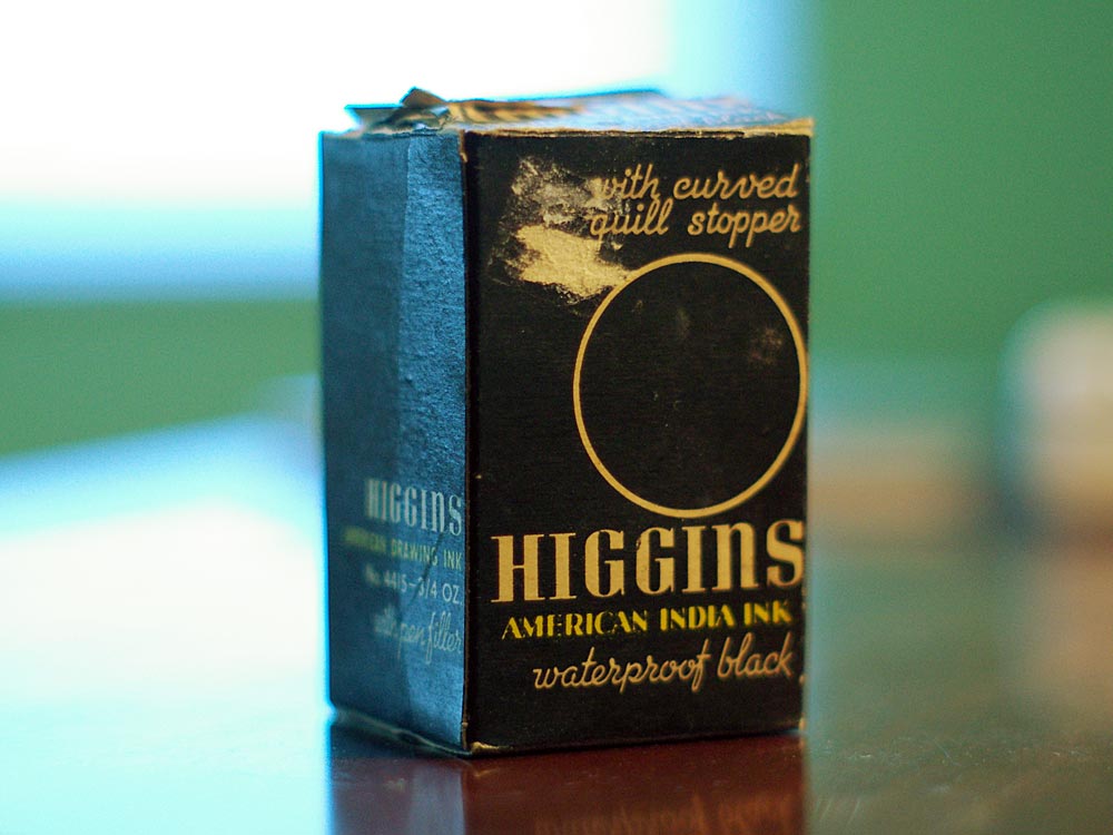
And second is a bottle of Higgins American India Ink still in the box.
All content copyright Jesse R. Ewing unless otherwise noted. Please don’t steal.