Sometime last year I overheard a conversation about a new Ohio license plate allegedly designed by the Governor’s wife, Frances Strickland. “That sounds like a bad idea,” I remember thinking at the time. A few months passed by and I pretty much forgot about that conversation until just recently, when I began to notice a new plate appearing on area cars, luridly clashing with just about every paint job. Was this a new vanity plate? I squinted but couldn’t make out any details. One thing seemed certain: it was popular.
The Bad Idea
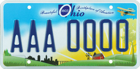
A quick visit to the Ohio Bureau of Motor Vehicles website showed that it was a new replacement plate option. A bit of research revealed that more than a million of the so-called Beautiful Ohio plates had been manufactured by Ohio prisoners over the past two years, costing the state $2.3 million to design and produce, and which had been sitting unused in a warehouse since the original plan, to sell them as the default replacement plate at a markup during a recession, had been thought better of. The fact that Governor Strickland was planning to run for reelection in 2010 probably figured into the decision as well. It doesn’t sound as though the plate was actually designed by the Governor’s wife, although stories suggest that she spearheaded the effort.
A new plan was devised by the Department of Public Safety’s director Cathy Collins-Taylor. As of November 2009, the new design would be offered as a choice alongside the Sunburst design, the then-current standard plate.
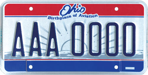
The Sunburst plate hasn’t exactly been loved, with most Ohioans complaining that they just didn’t get it, though the sunburst graphic was clearly cropped from the Great Seal of the State of Ohio.

The Public Response
At the end of March of this year, the BMV announced that starting June 7, the Beautiful Ohio plate would become the standard issue design. Since its November premiere, nearly 800,000 of the plates had been issued, a 3-to-1 margin over the Sunburst option. While a majority of Ohioans obviously preferred the new design, comments on the announcement at Cleveland.com’s Metro blog voiced some skepticism:
It looks airbrushed ... I half expect to read “Dusty luvs Misty” on them ....
These are completely hideous. They look immature and silly. As bad as they look up close (in the picture) they are far worse in person. When you see other people driving around, it just looks like a nasty mess of pastel blue and yellow. From any sort of distance, you certainly can’t make out the farm or the city skyline, and can barely even see that it says Ohio. The color scheme pretty much clashes with every car paint color, and looks especially ugly on black or red cars. It looks like the Land O Lakes butter carton. Ugh.
Wow those are ugly. Could we get a little more happening on there? How about John Glenn riding a cardinal.
I will pay however much the DMV wants for an alternative to this.
The Design
I suppose I could rant on and on about this visual mess, but most people seem to be happy with it. My main emotional response is simply disappointment. From a graphic point of view, it’s a mishmash of styles, from the realistic depiction of the Wright Flyer to the clip art of the red barn to the amateurish grass, trees, and primary yellow sunburst. It is indeed reminiscent of a Land O Lakes container, down to the centered “O” that successfully obscures the shape of the state beneath it. The rest of the type is clunky, too, especially in the poor kerning of the disjointed script face. But, like I said, I’m mainly disappointed, a feeling reflected in this headline from the design blog UnBeige: Ohio Disappoints with 3 to 1 Sales of New License Plate Design.
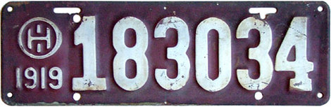
I understand that graphic and vanity plates are an important source of revenue, but I often wish we could go back to the plates of yesteryear which consisted of simple flat white or colored backgrounds with contrasting type. They were legible, and each state was easily recognizable at a glance. Or, how about a refresh of this plate from 1919? Look at that sweet Ohio logo.
For now, I’ll hold on to my 2003 Ohio Bicentennial plates until they rust through. Unless the BMV offers a design featuring John Glenn riding a cardinal. I’d pay money for that.